
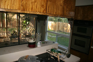
 The picture above is of an island that was sticking out into the kitchen and some cabinets that were above it. We felt like it really closed the room off and decided to take it out and open up the wall a little more between the kitchen and dining room.
And the wall is gone!


We also took down the furdown above the cabinets and redid the entire ceiling to accommodate more lights.

 My happy brother aka "the contractor"
  All of the wood in the kitchen was stripped and sanded. Then molding was added to the tops and bottoms of the cabinets as well as to the cabinet doors and drawers themselves.
Additional upper cabinets were built around the microwave as well as an additional lower cabinet to go on the other side of the stove.
 My brother and dad also built this amazing bar/island from scratch!
 This is the view from the inside of the kitchen. This is now my 'party cabinet'. I keep all my fun serving dishes, cocktail napkins and WINE right here! Love it!

 Now we've got some color on the cabinets!


 My brother and dad also built this amazing bar/island from scratch!
 This is the view from the inside of the kitchen. This is now my 'party cabinet'. I keep all my fun serving dishes, cocktail napkins and WINE right here! Love it!
 Now we've got some color on the cabinets!

It was important to us to keep the island/bar looking like its own special piece of furniture so it was painted black instead of the dark brown and also is supported on little feet instead of being flush with the floor.
 Almost done! The backsplash was another great addition that we almost skipped. I feel like it just makes a huge statement now and I love having the under cabinet lighting to show it off!

We've got can lights in the ceiling as well as under cabinet lights and lighting above the cabinets - apparently my contractor has a thing for lights!
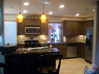 This garden window was a real eye sore until we jazzed it up with some fun curtains and bright accessories. Now its just my "fun" window and gives me something cheery to look at while doing dishes.

 The truly finished island/bar. We also put special hardware on this piece to distinguish it from the rest of the cabinets. You can't tell in this picture but there are little grape clusters on the hardware.
 And this is what is lurking on the other side of the kitchen - the breakfast room! We did reduce the size from the original breakfast room but we gained a much bigger kitchen, more counter space and a much more open feel for the whole layout downstairs. I love the stained glass fixture above the table!
 And now we move on to the dining room. As you can see whoever choose this floor was either very creative or very indecisive. We've got granite, marble and bamboo going on here!
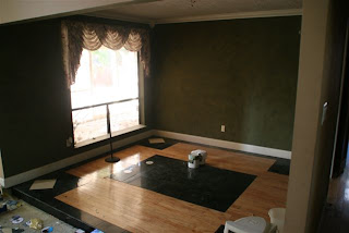 As I said before, we opened up more of the kitchen my removing part of the wall in the dining room and creating that island/bar into the kitchen. So now the large green wall that you see in this picture is only about 2/3 of that size.
The window above looks out onto the screen porch and really took up a lot of valuable wall space that was lacking in the dining room.

 So we closed it in....also if you look back at the picture above this one, you will see another window to the left looking out onto the screen porch...that one was in a wet bar that will soon be a computer nook so it was a goner too.

 Almost done! The backsplash was another great addition that we almost skipped. I feel like it just makes a huge statement now and I love having the under cabinet lighting to show it off!
We've got can lights in the ceiling as well as under cabinet lights and lighting above the cabinets - apparently my contractor has a thing for lights!
 This garden window was a real eye sore until we jazzed it up with some fun curtains and bright accessories. Now its just my "fun" window and gives me something cheery to look at while doing dishes.
 The truly finished island/bar. We also put special hardware on this piece to distinguish it from the rest of the cabinets. You can't tell in this picture but there are little grape clusters on the hardware.
 And this is what is lurking on the other side of the kitchen - the breakfast room! We did reduce the size from the original breakfast room but we gained a much bigger kitchen, more counter space and a much more open feel for the whole layout downstairs. I love the stained glass fixture above the table!
 And now we move on to the dining room. As you can see whoever choose this floor was either very creative or very indecisive. We've got granite, marble and bamboo going on here!
 As I said before, we opened up more of the kitchen my removing part of the wall in the dining room and creating that island/bar into the kitchen. So now the large green wall that you see in this picture is only about 2/3 of that size.
The window above looks out onto the screen porch and really took up a lot of valuable wall space that was lacking in the dining room.

 So we closed it in....also if you look back at the picture above this one, you will see another window to the left looking out onto the screen porch...that one was in a wet bar that will soon be a computer nook so it was a goner too.
 Here's a view of the 'after' from the screen porch:

And here's the finished dining room and screen porch!

 I love love love spending time out here in the evenings and even occasionally eat lunch out here - it makes me feel like I'm on vacation!

 I love love love spending time out here in the evenings and even occasionally eat lunch out here - it makes me feel like I'm on vacation!



1 comment:
WOW, I LOVE IT! You guys did a GREAT JOB! :)
Post a Comment